Tribe Review
Thanks to CARNIVAL OLE TING for this review and to Saucy and Triniscene for the pretty pics
OK people…..It’s that time of the year again…….Band Launch season (or as I like to call….TT$1,500 season….FORK IT OVER TO THE BAND TIME!!!!)
So, let’s cut to the chase…..
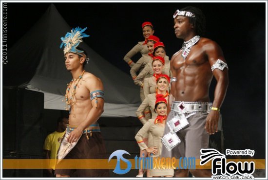
The theme of Tribe’s band this year is TAKE ME TO… The costumes are named after various destinations in the world…..some of the names of the costumes are a bit difficult to match to the colour combination or look of the costumes, but I guess until I get an inside scoop on the design process, would I be able to say that I see the CONCEPT behind the costumes (Guys, ah know allyuh doh care….as well as the ladies….but for me, a costume should make SOME sense….LOL) This year, the focus is on FEATHERS as opposed to beads…..and the use was feathers was done creatively and efficiently!!!!!
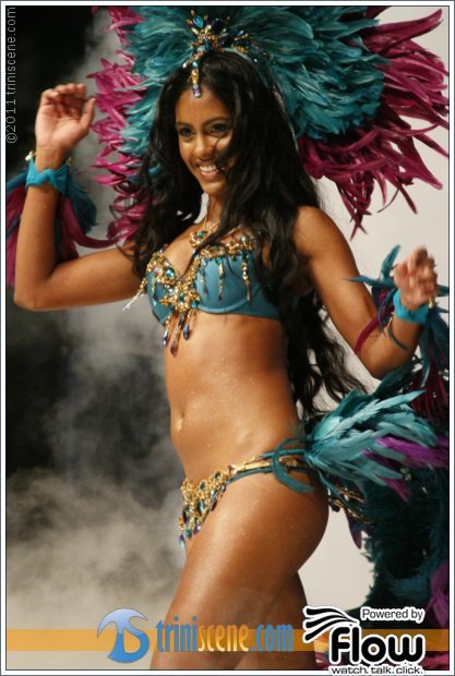
I AM PLAYING IN FIJI…..yes, it will be the first year that I will ever play in the same colour back to back (Teal/Green)…..but Solange Shaw-Gopaul has done an EXCELLENT job this year. The fusion of Teal/Green, Gold and brown is magnificent!!!!!
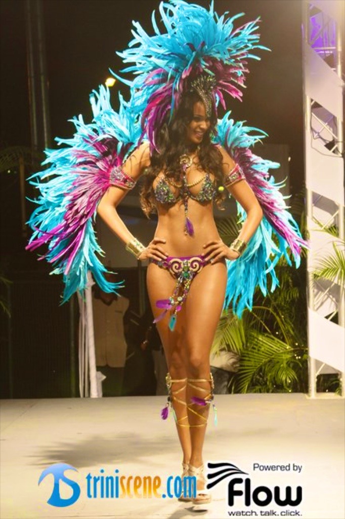
Now, ladies…I can SOOOOOOO see you ALL in Cyprus. This is the first year that I can actually say that I LOVE A SANDRA HORDATT COSTUME!!!!! It’s white…hottt….and F&^#(@! SEXY…..did I just say that?!?!?!?!?!?
And you know what……that’s it for me honestly….the 2 best section in the whole damn band.
So, now I will flip through the book and give an unbiased review…..and the reason I say UNBIASED is because I only know of a few of who ‘designed’ what … and there is a reason why I used quotations…..because some people didn’t design….they just marketing !!!!
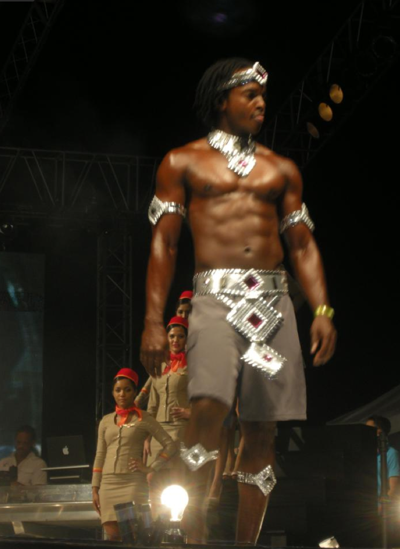
SOUTH BEACH (A kinda light/Electric Blue, Purple and Gold). I like this section…however, the bra in the book is plain…..a plainish purple bra….I can’t recall if this is what was actually shown. Men – simple chest/medallion piece….(YES)
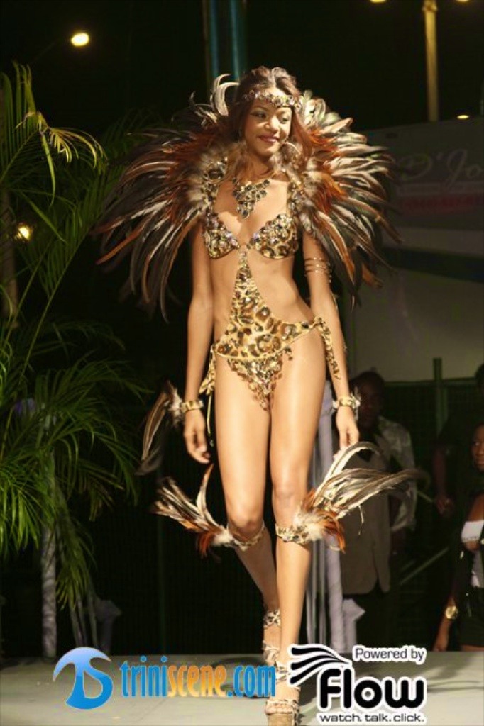
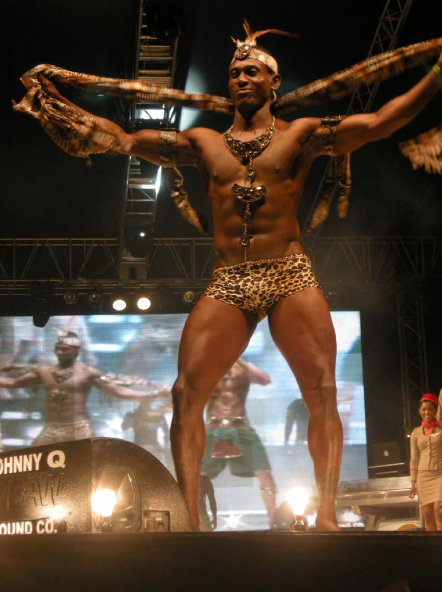
JOHANNESBURG (Leopard Print) – designed by Peter Elias…..now, one look at this costume and you would know that it is a Peter Elias costume. I have a problem though….last year (this year) you gave us Massai Warrior which was representative of Africa….yuh come back with the same blasted thing again?!?!?!?! (Where is your creativity Mr. Elias?!?!?!?!?) Now, the men have the same wrap business from last year…….the women however…..HOT…….the only problem with this costume (and any BROWN costume) is how it would look against yuh skin tone/colour.
VEGAS (Coral) (Yes, 7 years of art and I can identify a weird colour!!!!) This is a pretty simple costume! No “WOW” factor. The Male costume…..BLAH !!!!! (NOTE WORTHY POINT….the frontline is different as the flat feathered backpack is angled to ONE SIDE…..!)
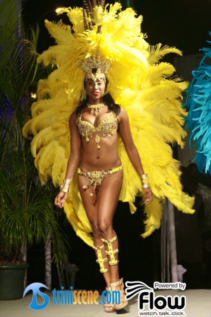
RIO (Yellow and Gold) – This is the Cocktails section….not designed by them….just their section!!!! I am sorry…..I was looking forward to see this section, but ….NAH….TOO YELLOW……..IT’S TOO YELLOW…..not enough relief of GOLD….needs more GOLD !!!!! The Male costume……BLAH!!!!
CYPRUS (White) – Sandra Hordatt’s section….I think I said all I had to say above…….however, I think the real HOTTNESS in this costume is in the frontline…..on closer inspection….the costume appears to have to bathing suit bottom….because it uses a nude bottom to give the PERFECT APPEARANCE OF NAKEDNESS. The Male Costume…..BLAH!!!!! (Then again….when you see this section, who gonna be looking at the men?!?!?!?!?)
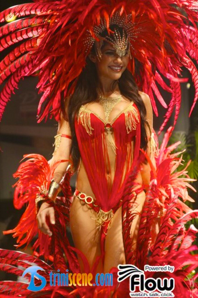
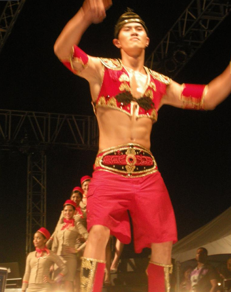
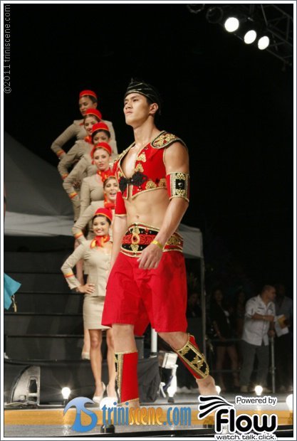
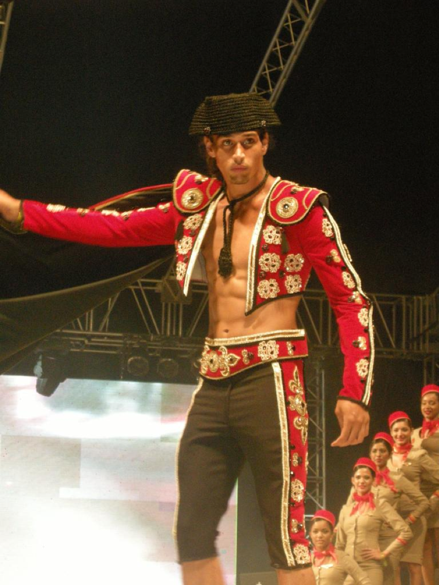
IBIZA (Red) – designed by Monique Nobriga…….now…..it’s partially reminicent of Silk of Rajastan….and by extension…yuh know what….Rajastan….NUFF SAID!!!!! The Male costume….when I saw it on stage….it looks as if it supposed to be a Matador…and to me there was even a Frontine/Individual male which made it stand out more as a Matador…..?!?!?!?!?!?!
MANHATTAN (Purple/Fushia/and a hint of Silver) … interesting combination of colour…..however….costume is pretty simple!!!!! The Male costume…hmm…..looks like one of the T-Shirts you can purchase which shows you a V-bottomed vest and a tie….now…take away the T-Shirt (Needing some BB emoticons here….right now, I’m using the CAN’T WATCH emoticon here now….LOL!)
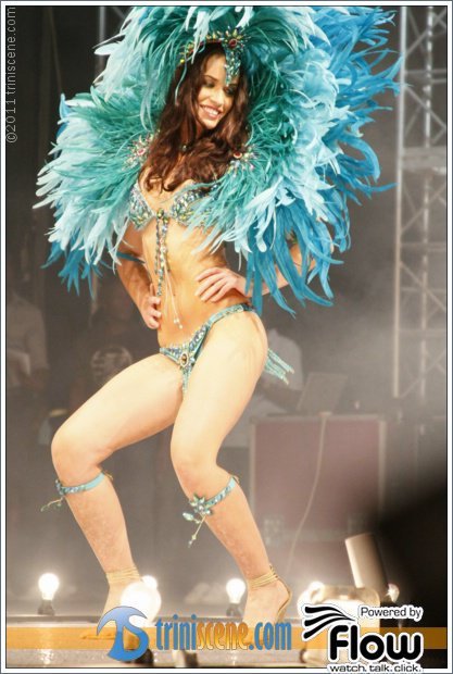
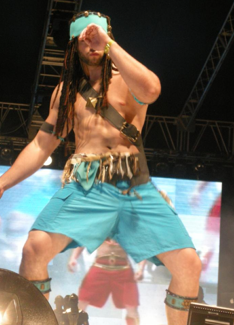
CANCUN (Blue Frost/Light Blue/Green)……WOW(ish). (Again….7 years of art is paying off….BLUE FROST?!?!?! LOL!) Colour combination….nice. The male costume……the fake dreads has NOTHING to do with Cancun……and when I think of Cancun…I think of SPRING BREAK….UNDERAGE UNIVERSITY STUDENTS….AND…oh wait….this is a public review……SMH!!!!
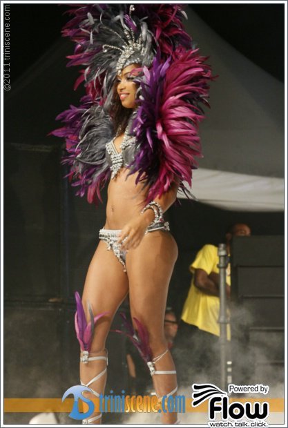
ST. TROPEZ (Pink….dare I say HOT PINK) – Gail Cabral’s section……sigh! Can I say….expected?!?!?!?!? However, I LOVE THE PINK……yuh eh catching me dead in it….but ah love it…..The Individual Female is ON!!!! However, it go lick down people on de road on Tuesday…. (I walking with a gardening shears to help TRIM de costume…!) Male costume…BLAH!!!!! (Grey pants??? REALLY!?!?!?!?!)
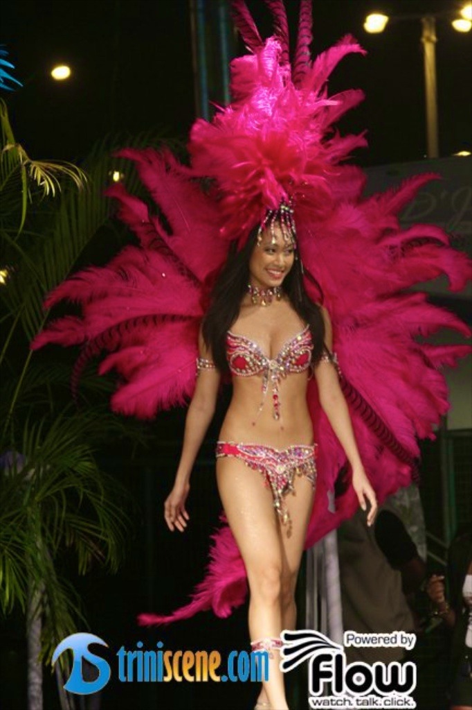
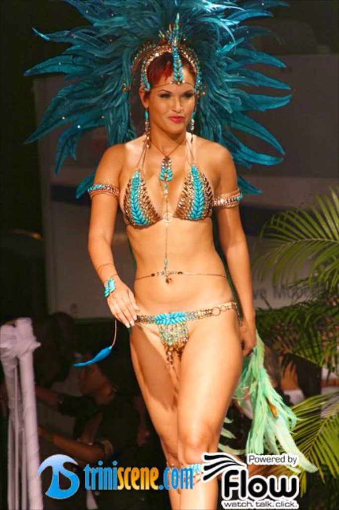
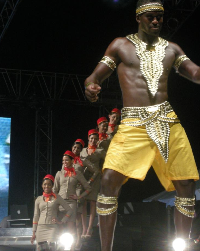
FIJI (Teal/Green with hints of brown) Not being biased….but THIS IS THE SECTION…………beauty in Frontline…backline…..YES!!! Solange Shaw-Gopaul has done it this year!!!!! I have never been CAPTIVATED by a costume before (Ok….except the year I played WARRIOR SPIRIT!!!) The female costume is hot….sexy…..current and relevant…..different to all the rest of costumes in the beading of the bra…..however, the waistband in the backline famle looks a little bit AFRICAN LOVEBIRD (See what ah talk about with Peter Elias and Africa?!?!?!? – NUFF SAID!) And for me, the selling point in the Male costume is that the chest piece is a necklace…..basically….YEAH!!!!! MALE COSTUME ON POINT !!!!!
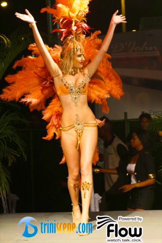
SANTORINI (Orange) Let me start my saying that it’s a bit OSAGE-ish. This costume is TOO ORANGE….for me that is. The Male costume is ON POINT!!!!!!
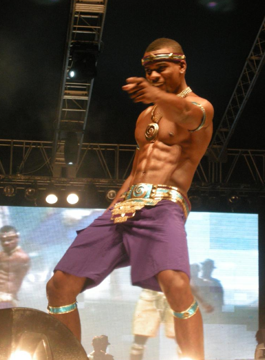
DUBAI (Purple and bluish-Green)……..CHARMEUSE REVISITED!!!!!!! Love the colours….but I keep thinking Charmeuse!!!! Female….nice….love the arm pieces!!!! Male costume….BLAH!!!!
And THAT’S IT !!!!! 12 SECTIONS !!!!!!
So, now the question is…….WHERE YUH PLAYING!!!!
DISCLAIMER
The views expressed above are those of a very conscious yet sleep deprived CARNIVAL OLE TING who wrote this whilst consuming a cup of coffee and 2 Quaker Chewy Granola Bars (Chocolate Chip and Low Fat S’mores……just in case yuh wanted to know!!!!)….however, it is a true representation of his recollection.


Thanks for the correction 🙂
The pink section “San Tropez” was designed by Gail Cabral not Val 😉